February 17, 2021
Checkwriters has a new look
[but we’re still Checkwriters]
We’re excited to announce that today we’re launching a new logo and colors! While we’re still Checkwriters, and still primarily orange, here’s what’s changing as part of our brand refresh:
New Logo
Checkwriters now has a stand-alone logo independent of our company name. Our new logo is designed to represent our forward-thinking, positivity, and upward trajectory – all qualities we embody that put customer experience at the heart of everything we do! The combination of shapes form an abstract quill and alludes to the angle of a checkmark, reinforcing our name and illustrating our expertise and attention to detail.

New Colors
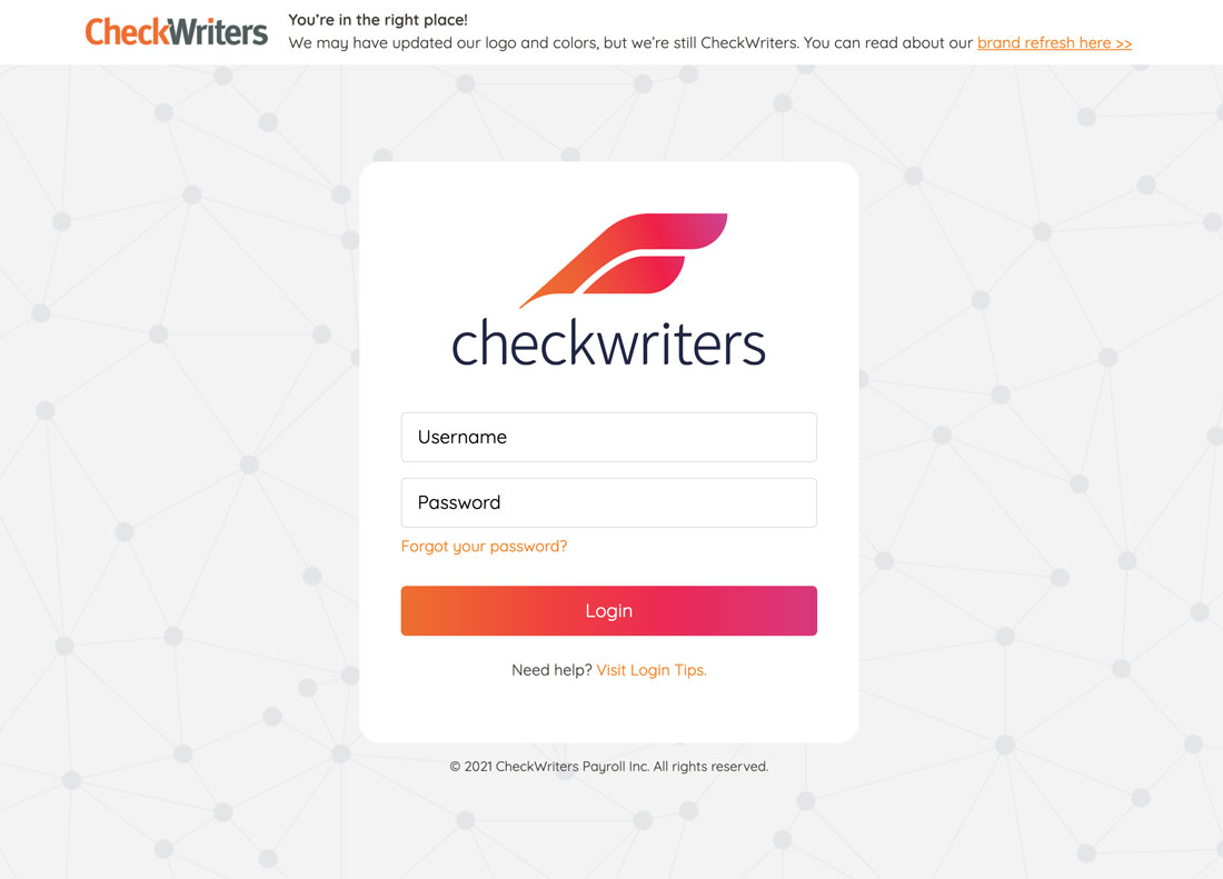
As you probably know, orange has long been our primary color – we’re keeping that consistent. However, we’ve added navy blue as our secondary color as well as some neon gradients you’ll notice in the logo, on our refreshed site, and in our software. While we’ve always been a Payroll company, our software also includes Applicant Tracking, Background Screening, Onboarding, Benefits, Attendance, HR + Compliance, and an Employee App! This range of additional colors will help us communicate the range of technology products we now offer.
The first places you’ll notice our new look is on our site and on the Checkwriters login page.
You’ll notice our brand refresh continuing over the next months – we’re looking forward to it!